UX/UIVisual
The Where Pass —
What I did
Design system
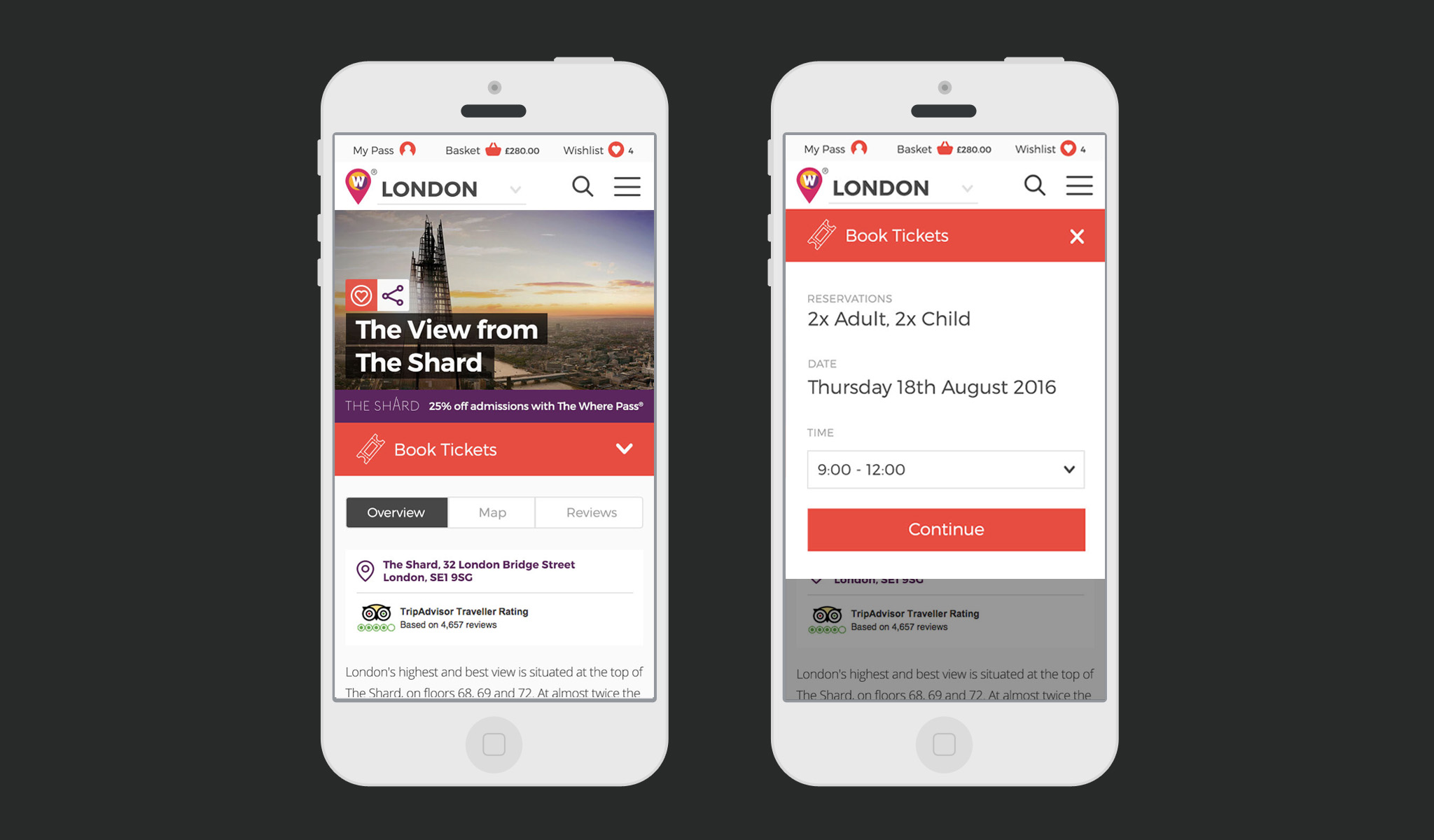
Responsive design
Visual design
Visual language
UI design
Create an e-commerce and editorial platform for The Where Pass, a new travel card for visitors to major European cities.
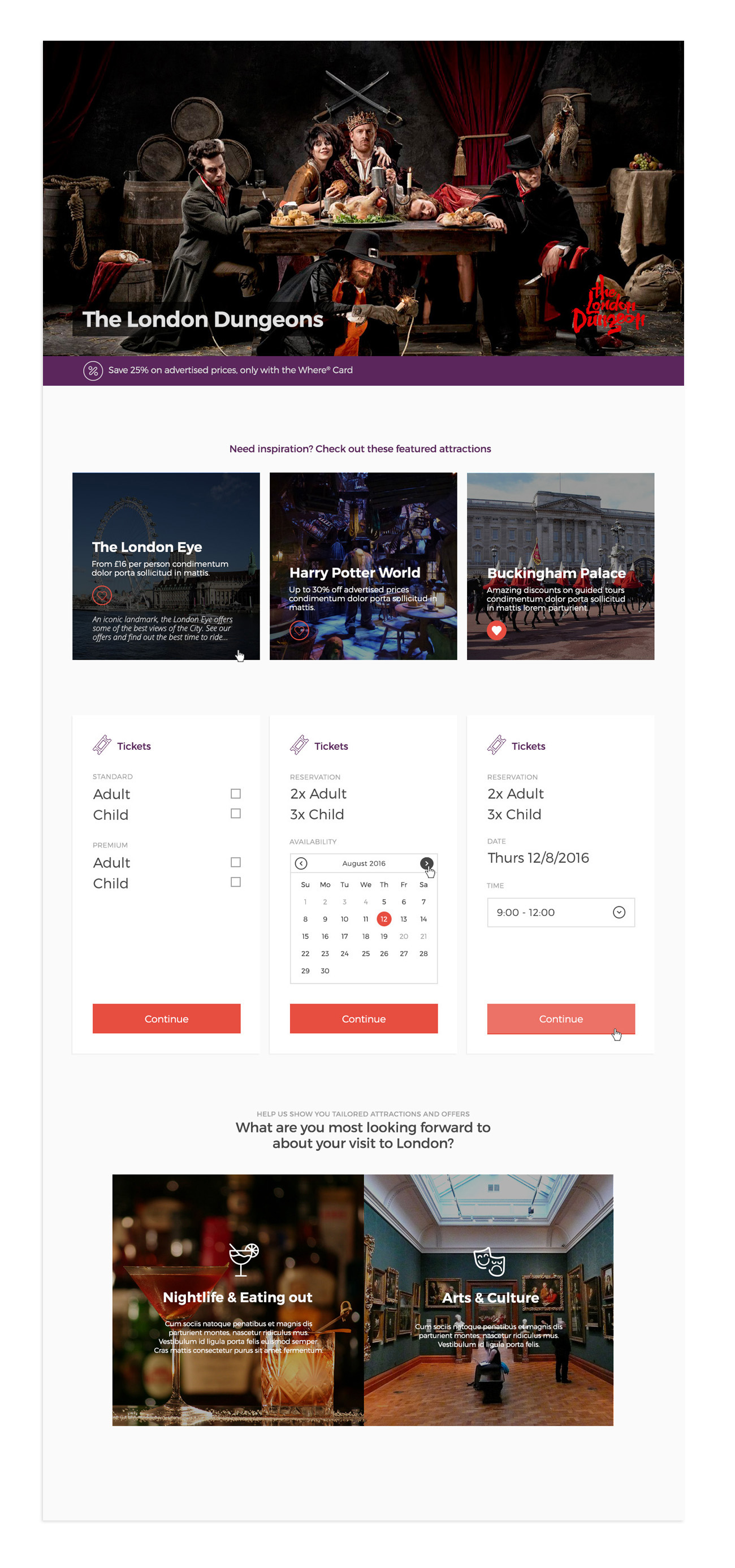
Providing users with discounted, fasttrack access to many of Europe’s main tourist attractions, and doubling as a contactless travel card, the pass is a great option for young travellers, families, or any budget conscious traveller wanting to get the most from their trip.
I led the UI design of the site, developing digital style guides and components that were sleek, fast and reusable across the international digital properties.
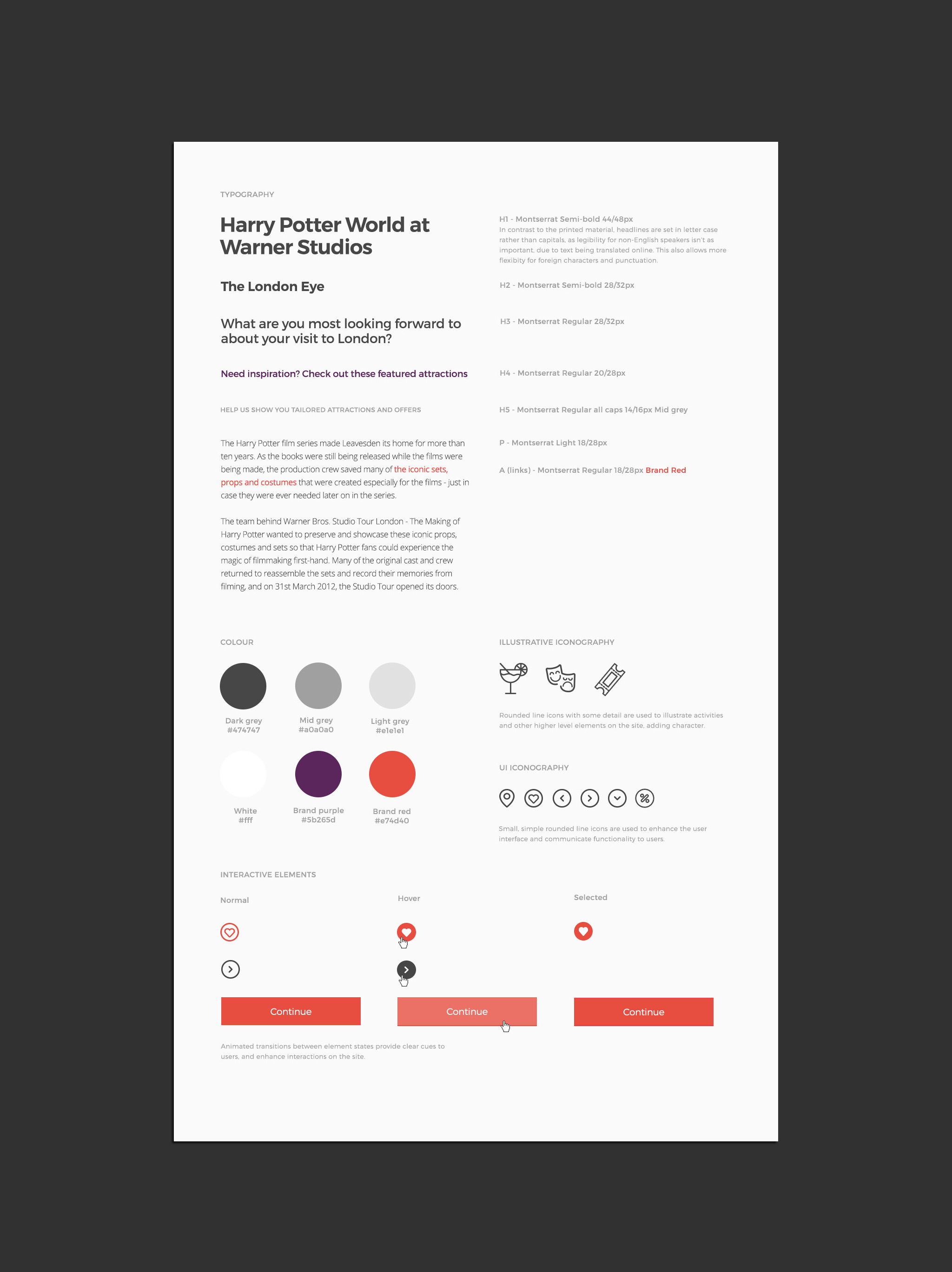
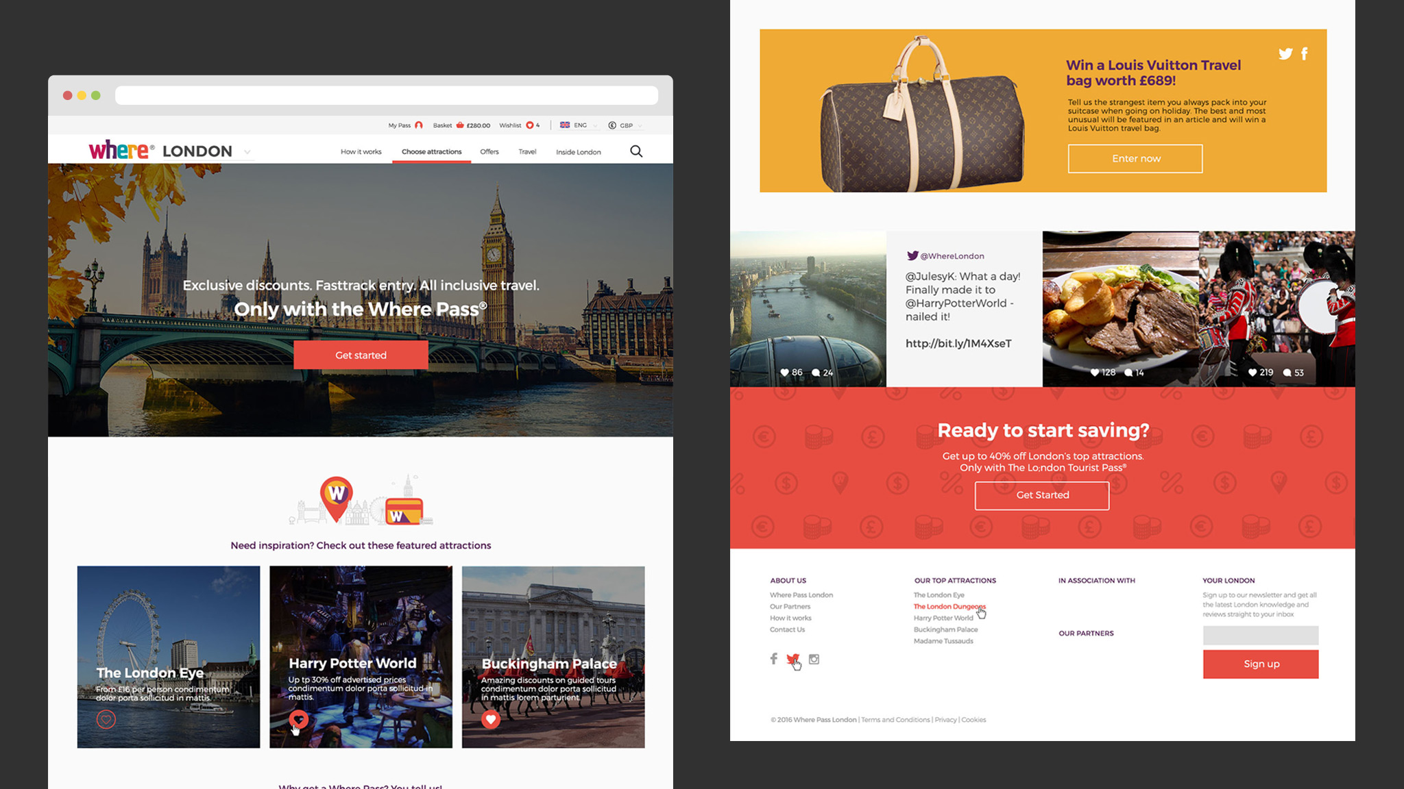
Initial style guides identify these key aspects of the visual design, and communicate the core visual style of The Where Pass’ online presence. I developed a visual direction that built on the print guidelines, and gave The Where Pass a digital direction of it's own.
Creating a clear, consistent interface, that enabled users to explore what The Where Pass has to offer and start using their passes with the minimum of fuss was crucial, and the type and colour choices reflect this. A chunky rounded line iconography style adds a touch of playfulness, and aids communication of the key navigation elements and journeys.
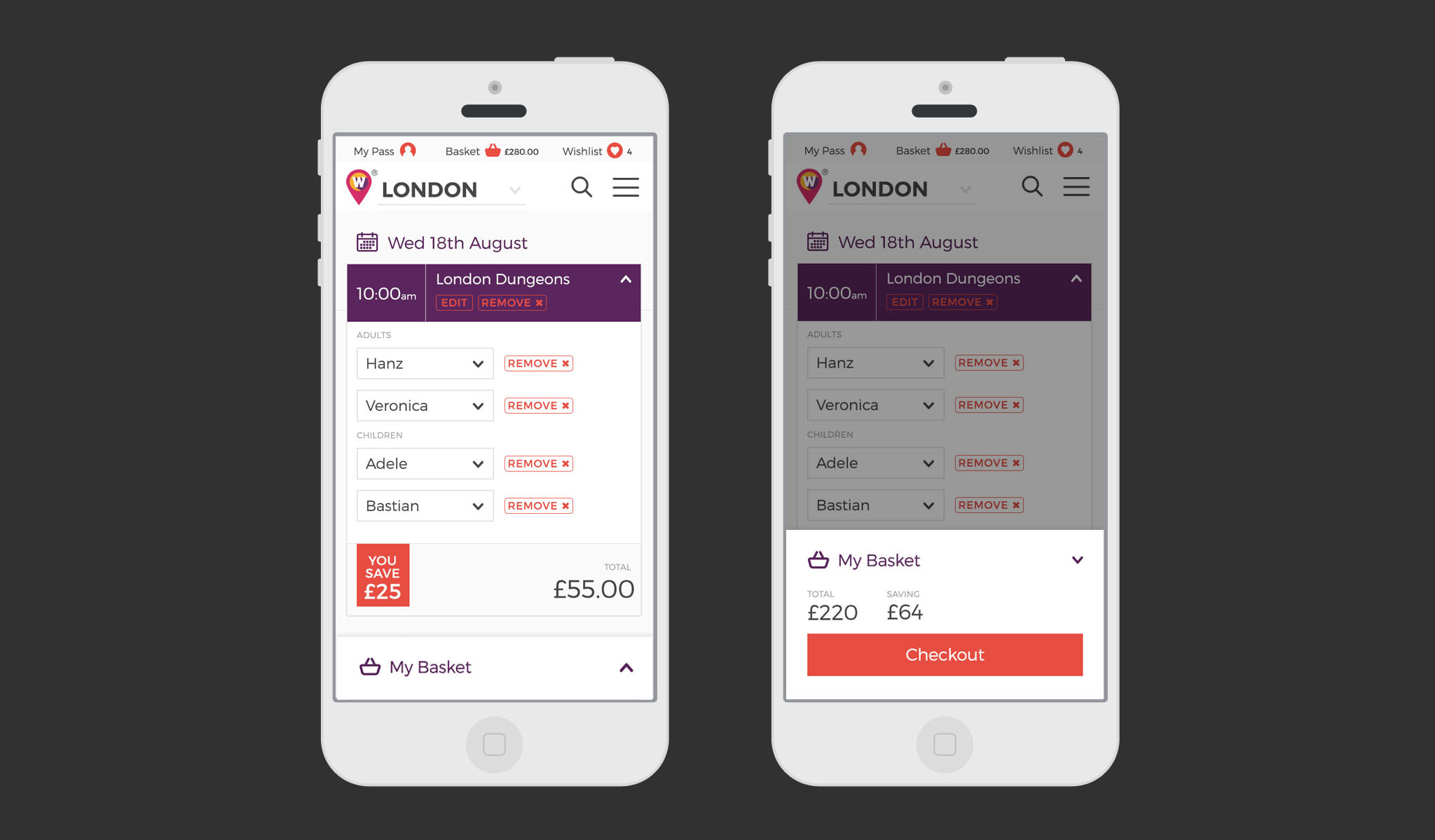
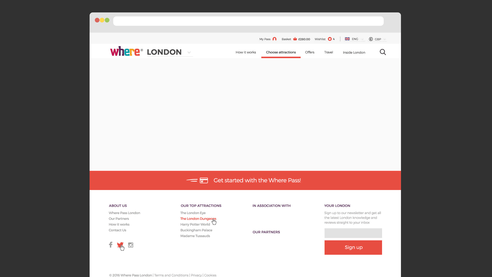
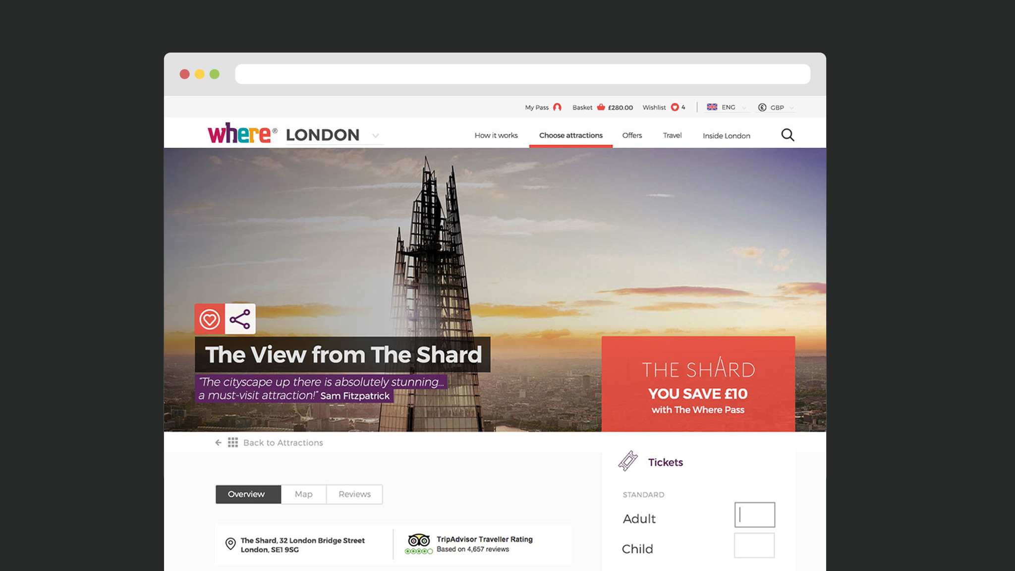
The site is the main point of contact for many users of the pass, providing an easy way to buy passes, add attractions, and build up an itinerary. As the pass can be used repeatedly in different cities, I created a dropdown location picker to enable the user to very easily switch destination city, without leaving the central content hub of the site.

![]()
Further development of the visual language led to using icon patterns and other brand colours as backgrounds and accents, to reinforce the Where brand across the site.
Visit the site at wherepasslondon.com