Brand
Cantab Fitness —
What I did
Art direction
Brand Naming
Brand identity
Competitor research
Logo design
Visual language
Cantab Fitness are a group of Cambridge-based personal trainers united by the desire to get people fit, healthy and happy using proven techniques and approaches backed up by research.
The essential elements of the Cantab brand are the ‘whitepaper’ and ‘upward trajectory’ graphic marks which make up the Cantab Fitness logo. The ‘whitepaper’ graphic shape is a reference to research papers and the academic background of both the practitioners and techniques utilised by Cantab Fitness. The ‘upward trajectory’ line charts improvement and positive steps toward a goal.
They use a no-nonsense, clear and accessible visual language of simple, rounded graphic lines, iconography and a nod to instructional design. A core icon set of 3 supporting icons helps commmunicate Cantab’s message


Cantab’s tone of voice is just like their coaching - no-nonsense, positive and practical.
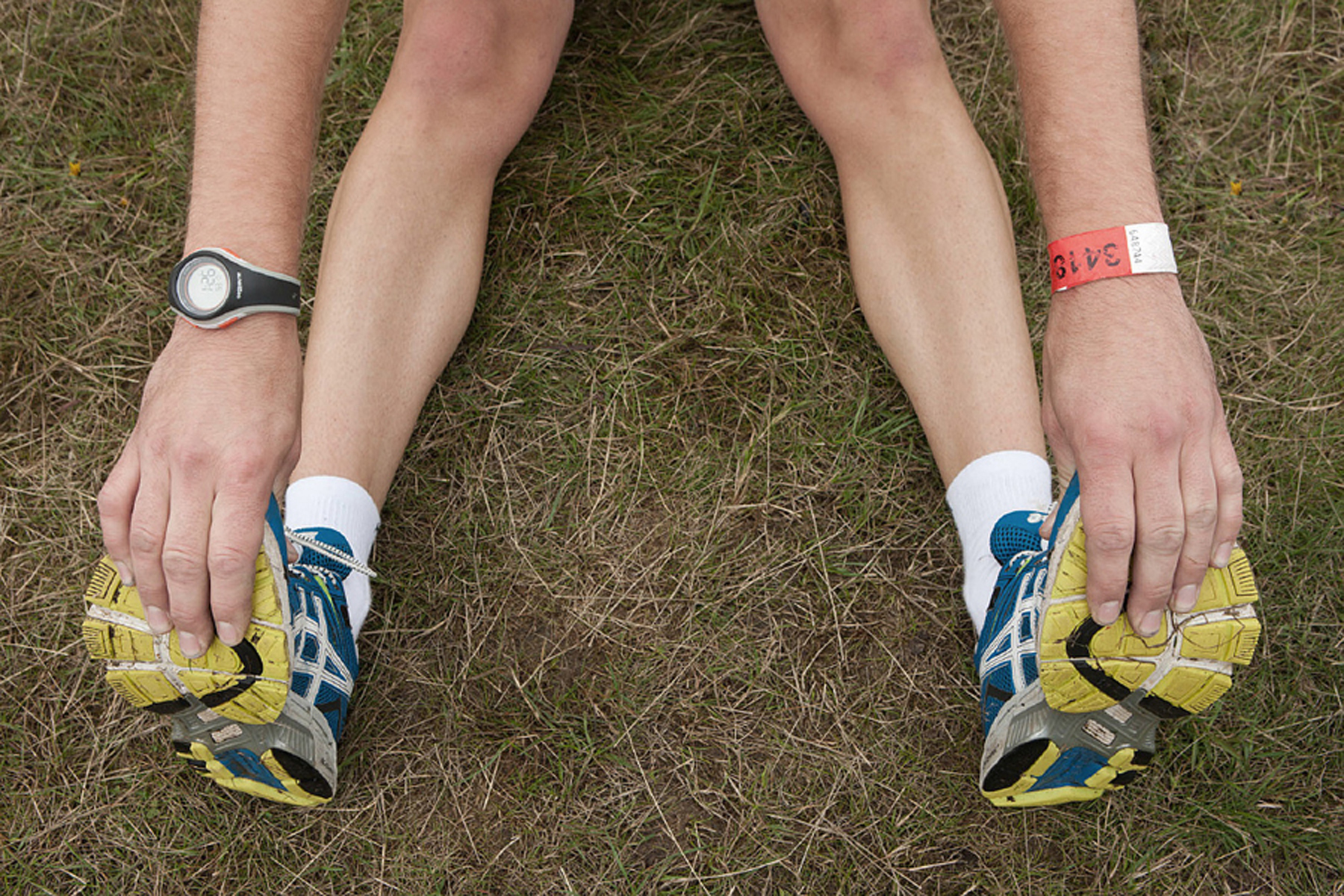
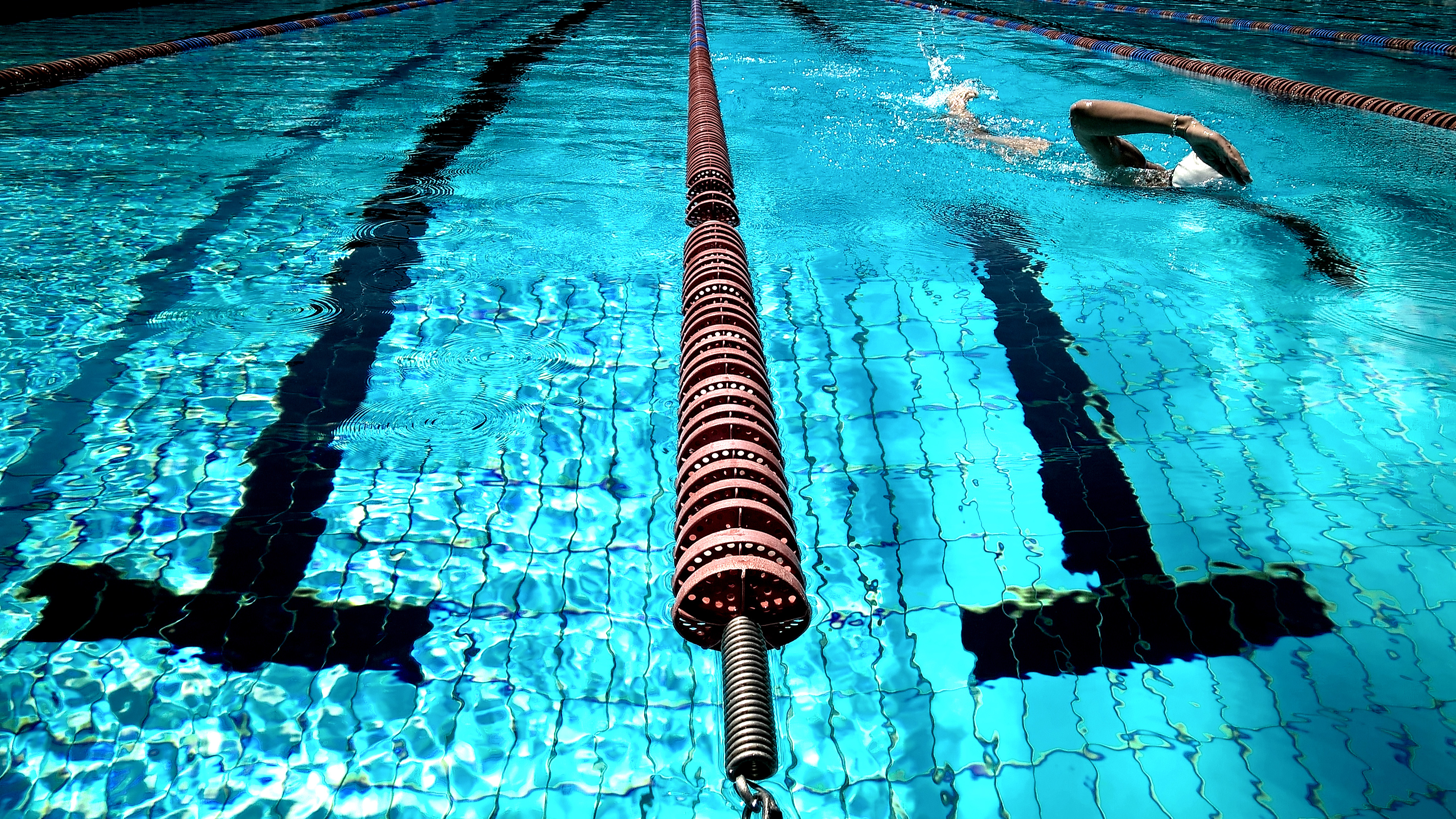
Imagery plays a key role in Cantab Fitness’ communications - candid shots from real people’s points of view. Compositions and subject matter are quirky and characterful, and differentiate from competitors polished, toned poses or mud, sweat and tears approaches.